Eclipse Coffee – Branding, Design & Art Direction
Eclipse Coffee was built for those who see coffee as more than a routine—it’s a ritual. We developed the full brand identity, packaging system, and creative direction, ensuring every touchpoint felt intentional, elevated, and unmistakably Eclipse.
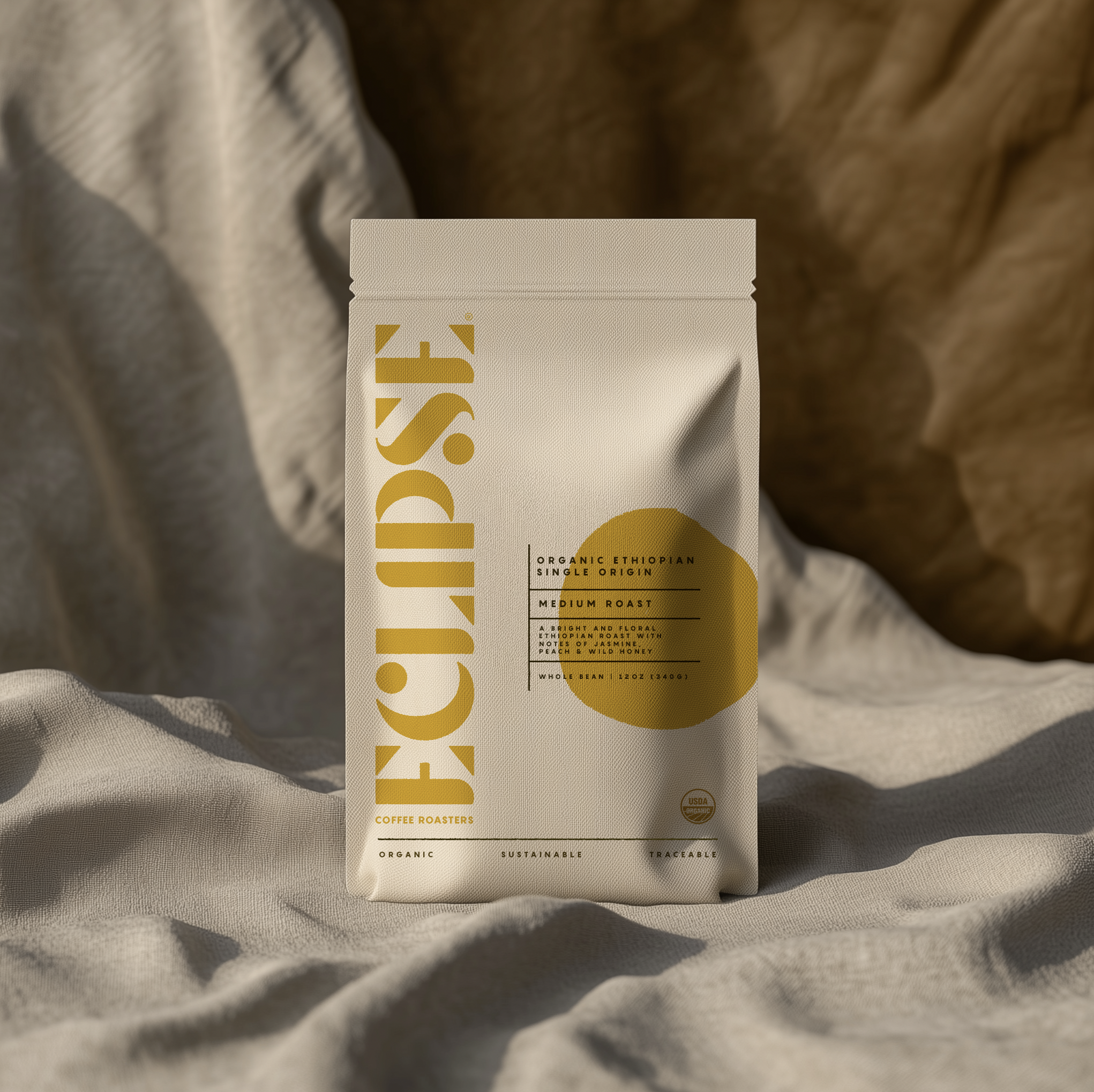
Brand Identity & Packaging
Eclipse needed to stand out in a crowded market. We created a bold, type-driven identity with a custom, vertical wordmark, a structured yet minimal layout, and a dynamic color system to differentiate roasts while maintaining brand cohesion. The sustainable matte packaging features subtle embossed details, reinforcing a premium feel.
The Coffee Collection
We designed a modular product system that supports single-origin selections, espresso blends, and limited editions. Each bag highlights roast level, elevation, process, and tasting notes, making the experience both sensory and visually distinct.
Creative Direction
Our photography and campaign approach blends warm, moody lighting with clean, minimal compositions, creating a brand that feels refined yet effortless. We also extended the identity into café and retail concepts, ensuring a seamless transition from packaging to physical spaces.
A Brand Designed to Evolve
Eclipse is built for growth, with a design system that allows for future blends, merchandise, and retail expansion while keeping the core identity strong. This is coffee, designed with intention.