Home Ground Lab
A thoughtful working name with warmth and process, but one that felt more internal than public.
'%3e%3cpath%20id='Path_1'%20data-name='Path%201'%20d='M94.835,174.668c-6.51-.164-13.026-.206-19.531-.521-8.113-.393-16.206-1.079-24.252-2.257a195.119,195.119,0,0,1-27.08-5.769,79.649,79.649,0,0,1-15.269-6.1,23.4,23.4,0,0,1-6.025-4.414,8.883,8.883,0,0,1-2.614-4.874A7.2,7.2,0,0,1,1.047,146a14.424,14.424,0,0,1,3.629-3.994,31.163,31.163,0,0,1,5.8-3.534,82.418,82.418,0,0,1,16.167-5.66,196.9,196.9,0,0,1,24.441-4.4q9.744-1.191,19.545-1.786c11.371-.683,22.747-.886,34.126-.477q9.807.351,19.595,1.19c7.5.633,14.982,1.536,22.4,2.887a128.826,128.826,0,0,1,23.488,6.329,47.554,47.554,0,0,1,8.982,4.5,18.4,18.4,0,0,1,3.69,3.1,8.3,8.3,0,0,1,2.369,5.889,7.643,7.643,0,0,1-1.5,4.311A16.8,16.8,0,0,1,179.5,158.4a52.992,52.992,0,0,1-11.109,5.515,131.815,131.815,0,0,1-19.634,5.521,185.711,185.711,0,0,1-18.672,3.121c-4.607.507-9.227.914-13.848,1.279-7.121.566-14.258.686-21.4.833Zm-58.3-41.72c-.348.064-.541.089-.725.137a59.829,59.829,0,0,0-8.8,2.873,41.782,41.782,0,0,0-7.814,4.18,17.9,17.9,0,0,0-4.59,4.434,8.745,8.745,0,0,0-.134,10.178,16.159,16.159,0,0,0,1.586,2.009,21.927,21.927,0,0,0,5.51,4.281,63.055,63.055,0,0,0,15.317,5.928,10.827,10.827,0,0,0,2.82.357q33.552-.063,67.106-.106c12.862-.014,25.726.006,38.588-.017a13.834,13.834,0,0,0,3.325-.34,58.781,58.781,0,0,0,14.7-5.618,21.808,21.808,0,0,0,7.324-6.193,8.5,8.5,0,0,0,.474-9.9,16.113,16.113,0,0,0-5.223-5.29,52.292,52.292,0,0,0-16.61-6.834.754.754,0,0,0-.32.053c.332,1.864.7,3.668.961,5.485a33.128,33.128,0,0,1,.4,5.616H35.229a48.921,48.921,0,0,1,1.307-11.228Z'%20transform='translate(0%20-90.84)'%20fill='%23f8f8f8'/%3e%3cpath%20id='Path_2'%20data-name='Path%202'%20d='M253.421,94.83H152.49a5.679,5.679,0,0,1,.217-.638c.649-1.254,1.321-2.5,1.954-3.762a1.494,1.494,0,0,1,1.622-.948c1.179.084,2.366.022,3.551.022q44.55-.008,89.1-.011c1.864,0,1.4-.254,2.349,1.36.73,1.237,1.363,2.531,2.132,3.977Z'%20transform='translate(-109.999%20-64.542)'%20fill='%23f8f8f8'/%3e%3cpath%20id='Path_3'%20data-name='Path%203'%20d='M168.033,316.854c.839-.22,91.294-.248,92.3-.031a5.322,5.322,0,0,1-.326.588c-.948,1.3-1.934,2.581-2.848,3.9a1.963,1.963,0,0,1-1.825.881c-8.026-.022-16.05-.011-24.076-.008q-28.861.008-57.725.036a2.53,2.53,0,0,1-2.26-1.051c-.964-1.29-1.979-2.542-2.965-3.815a3.486,3.486,0,0,1-.279-.507Z'%20transform='translate(-121.208%20-228.422)'%20fill='%23f8f8f8'/%3e%3cpath%20id='Path_4'%20data-name='Path%204'%20d='M267.869,50.163H185.63a3.047,3.047,0,0,1,.368-.577c1.469-1.413,2.951-2.809,4.42-4.219a1.918,1.918,0,0,1,1.432-.5c4.08.017,8.16.008,12.237.008q28.523,0,57.048-.031a3.293,3.293,0,0,1,2.779,1.081c1.037,1.187,2.2,2.266,3.294,3.4a10.615,10.615,0,0,1,.655.842Z'%20transform='translate(-133.903%20-32.346)'%20fill='%23f8f8f8'/%3e%3cpath%20id='Path_5'%20data-name='Path%205'%20d='M277.666,359.82c-.265.251-.412.418-.585.549-1.887,1.43-3.785,2.843-5.657,4.289a2.232,2.232,0,0,1-1.485.376q-8.979,0-17.956.008-18.055,0-36.107.011a3.706,3.706,0,0,1-2.38-.719c-1.731-1.3-3.484-2.581-5.231-3.865-.2-.15-.429-.273-.644-.407.056-.081.111-.162.167-.24h69.882Z'%20transform='translate(-149.765%20-259.544)'%20fill='%23f8f8f8'/%3e%3cpath%20id='Path_6'%20data-name='Path%206'%20d='M293.874,5.733H244.44C248.007,3.364,258.191.285,266.822.026,279.123-.342,289.287,2.893,293.874,5.733Z'%20transform='translate(-176.323%200)'%20fill='%23f8f8f8'/%3e%3cpath%20id='Path_7'%20data-name='Path%207'%20d='M241.363,222.513a2.415,2.415,0,0,0-.407-.1q-56.786-.017-113.569-.022a4.171,4.171,0,0,0-.491.045c-.028,0-.053.036-.078.059s-.045.045-.128.134A31.4,31.4,0,0,0,127.819,229H240.466a34.8,34.8,0,0,0,.9-6.491Z'%20transform='translate(-91.389%20-160.414)'%20fill='%23f8f8f8'/%3e%3cpath%20id='Path_8'%20data-name='Path%208'%20d='M277.26,396.48a11.57,11.57,0,0,0,3.191,1.614h-.008a.47.47,0,0,1,.059.02,32.875,32.875,0,0,0,9.122,1.722q1.689.117,3.394.106s9.921.265,17.479-3.461Z'%20transform='translate(-199.996%20-285.987)'%20fill='%23f8f8f8'/%3e%3c/g%3e%3c/svg%3e)
Ground-up brand creation
Naming · Strategy · Identity · Illustration · Website
Helping Home Ground Lab become Everyplace: a clearer, warmer, more memorable brand for beauty, dignity, and belonging in places never designed for actual life.
The assignment
Before it was Everyplace, the organization was called Home Ground Lab. The work already had a powerful center: partner with refugee communities to transform camps, settlements, and shelters into places of beauty, dignity, and belonging.
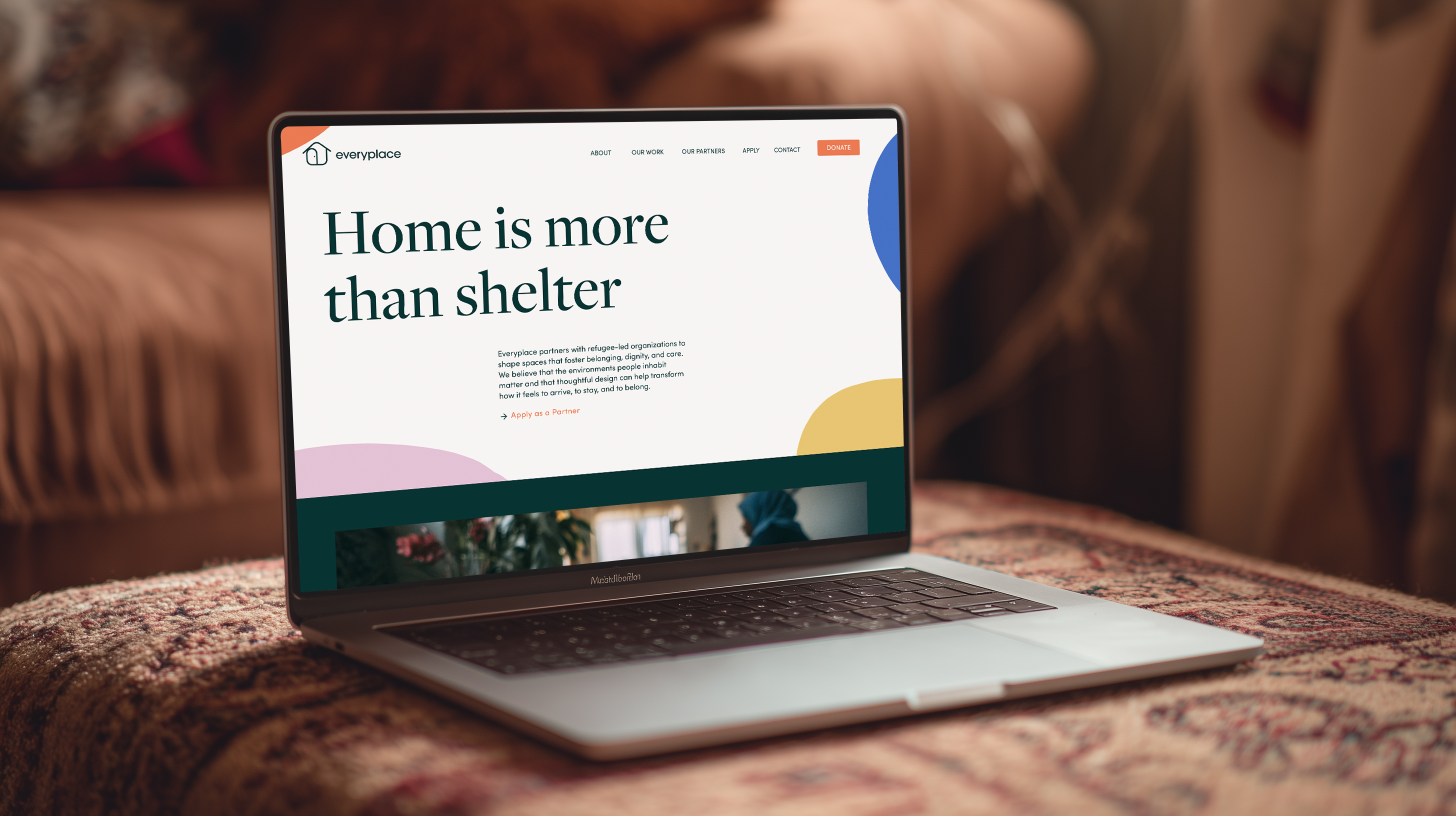
Our job was to help that idea become easier to understand, easier to share, and easier to support. We helped shape the name, the story, the visual world, and the first digital expression of a brand that believes every place deserves to feel like home.
The result is not just a logo or a website. It is a brand system built from the ground up, designed to make a deeply human model feel clear, credible, and alive.
The rename
A thoughtful working name with warmth and process, but one that felt more internal than public.
A simple, ownable belief: beauty and belonging should not be reserved for somewhere else.
How the brand works
01 / Naming
02 / Story
03 / World
The center of the story
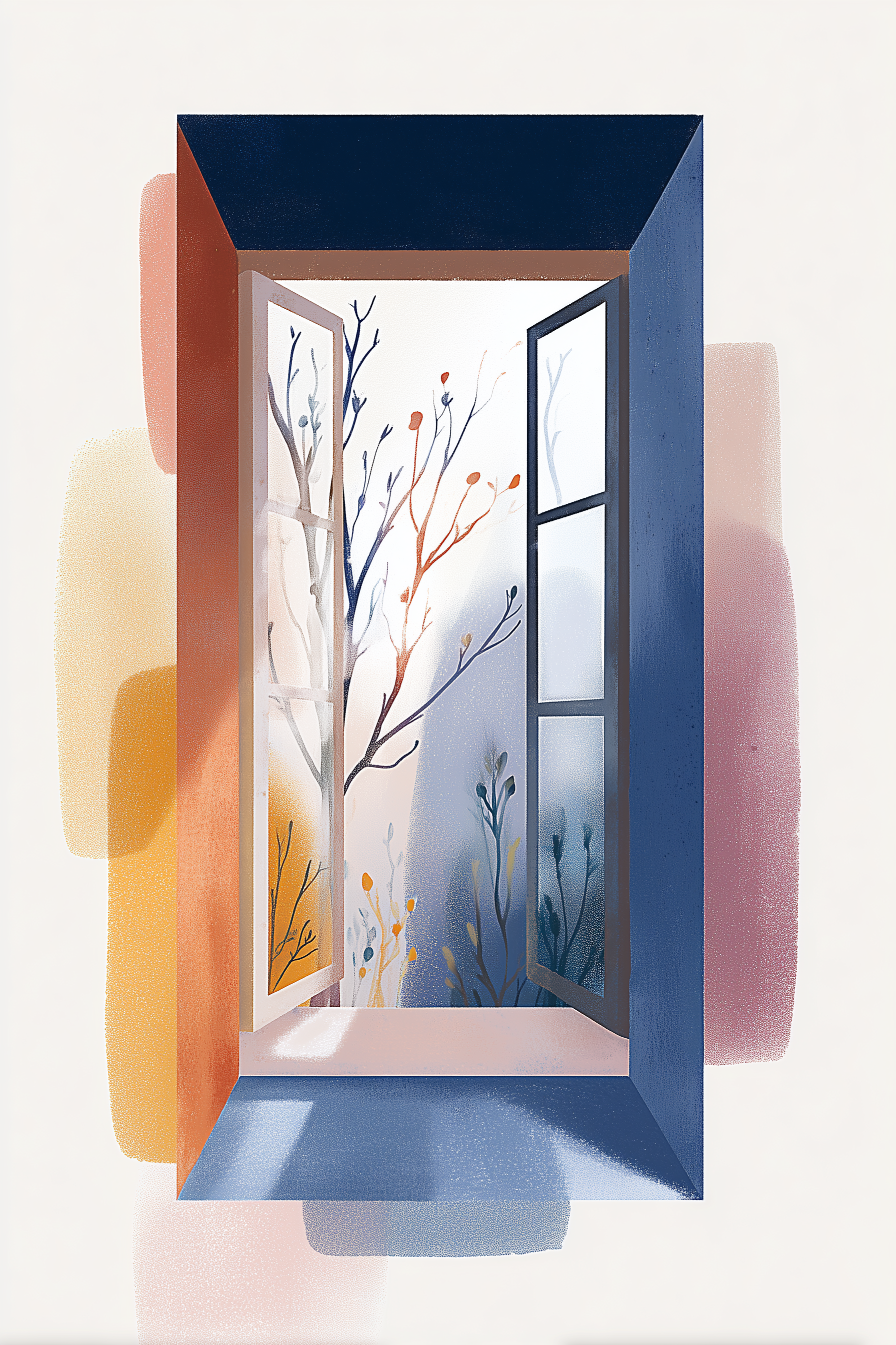
Not beauty as decoration. Beauty as dignity. Beauty as belonging. Beauty as the quiet, powerful act of saying: I am still here. This place is mine. I matter.
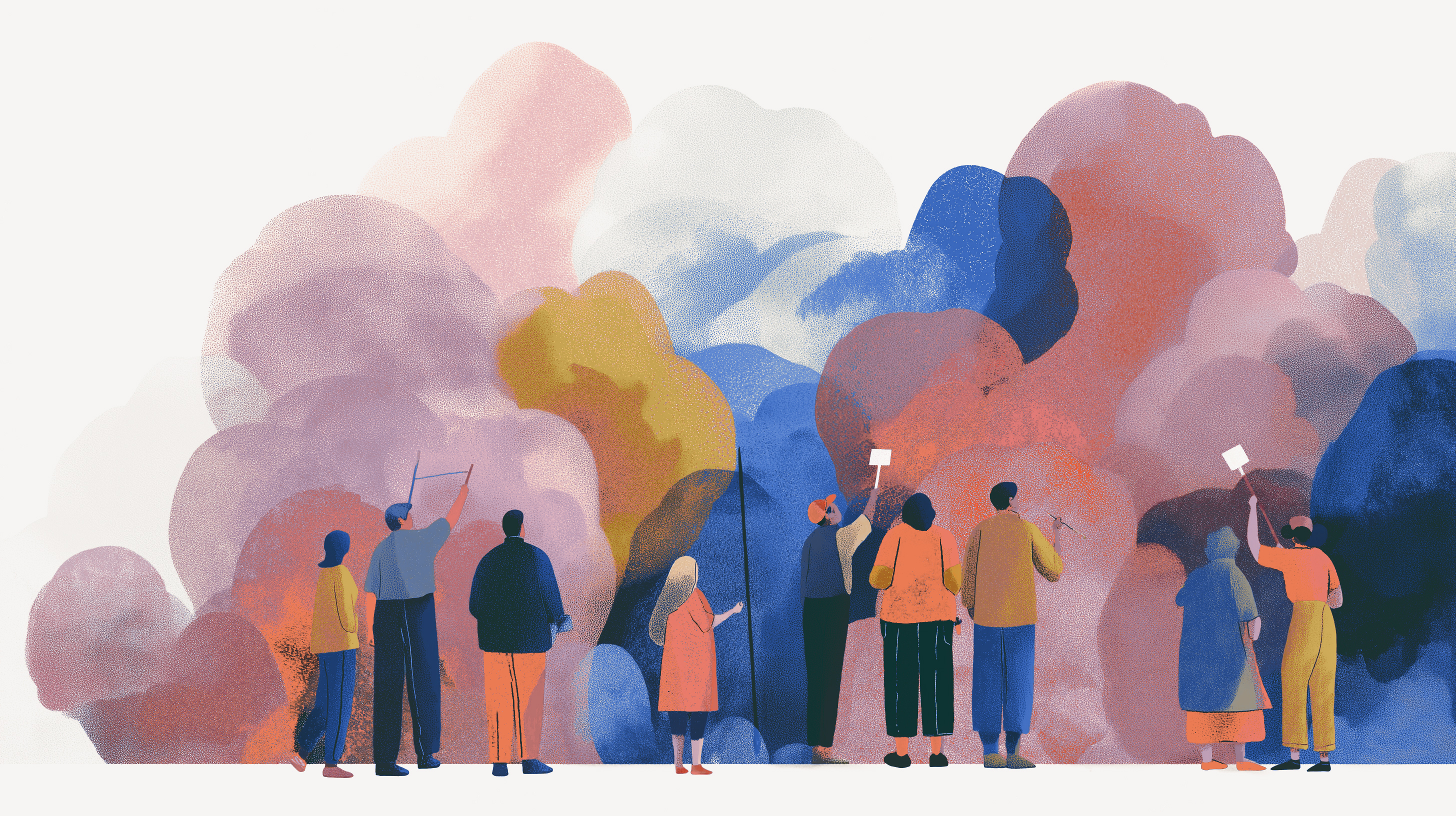
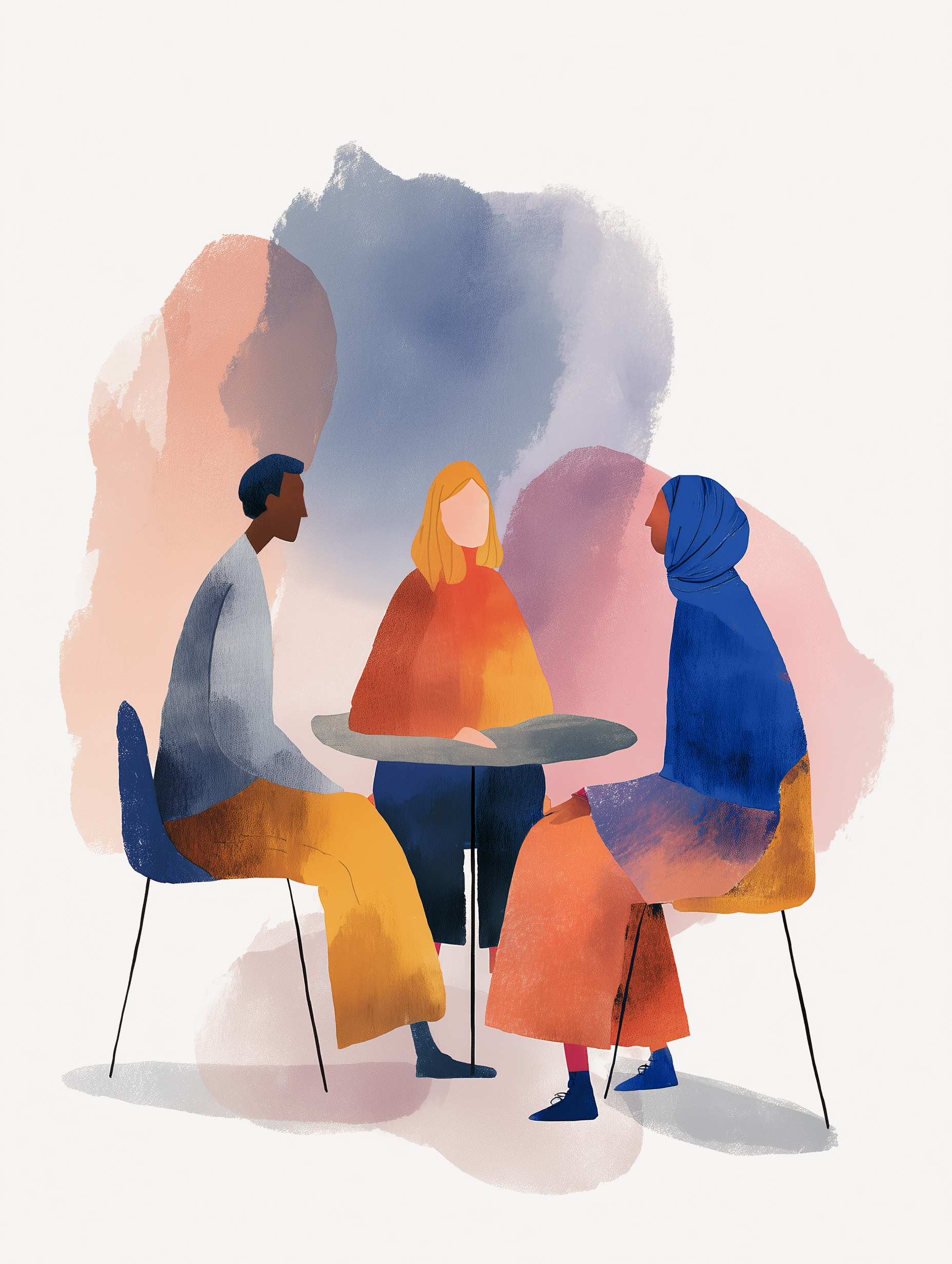
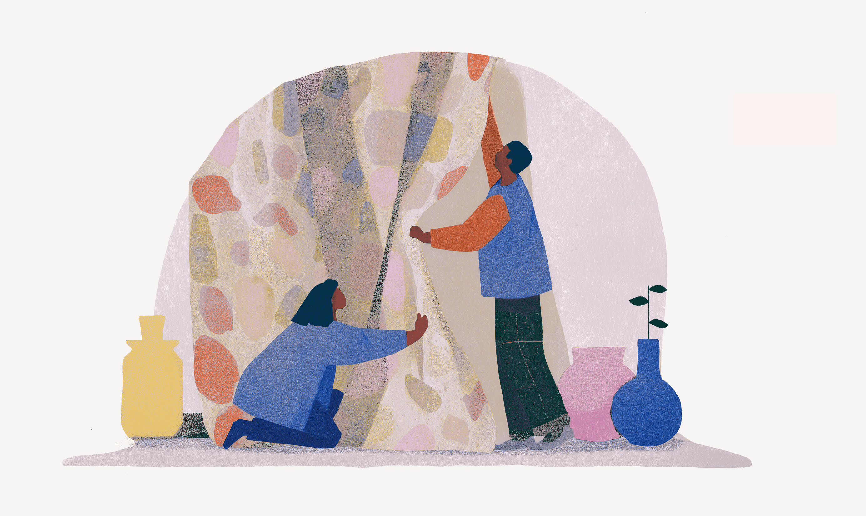
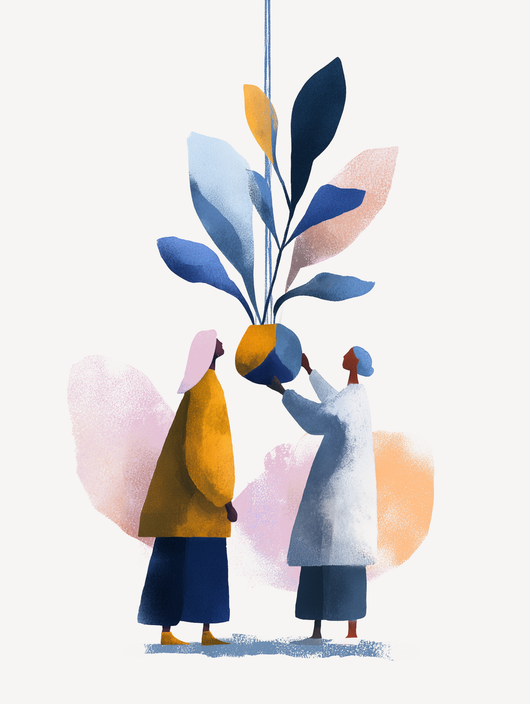
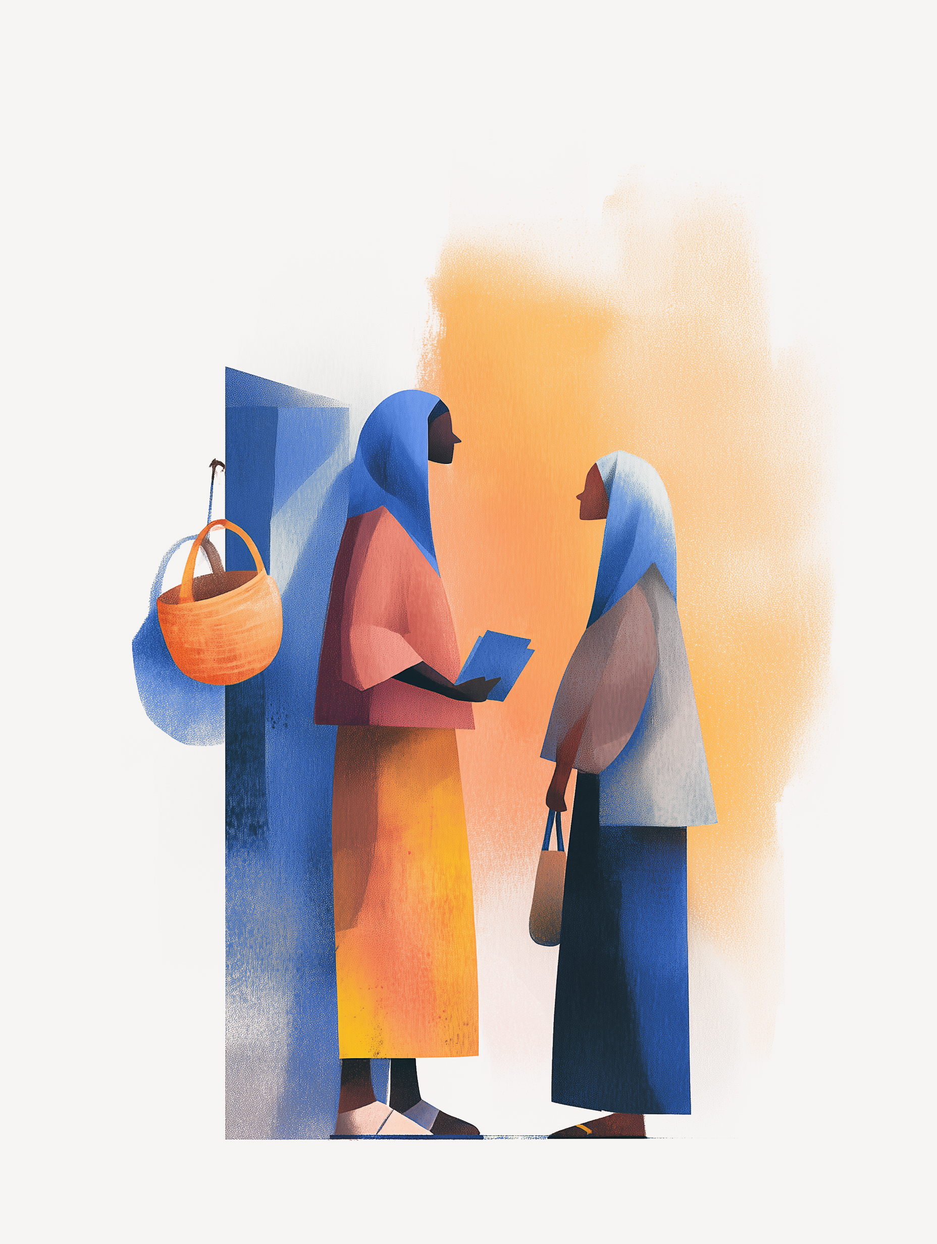
Everyplace exists to recognize the impulse communities already have to plant, paint, gather, repair, and make home - then fund it and help it go further.
The work in practice
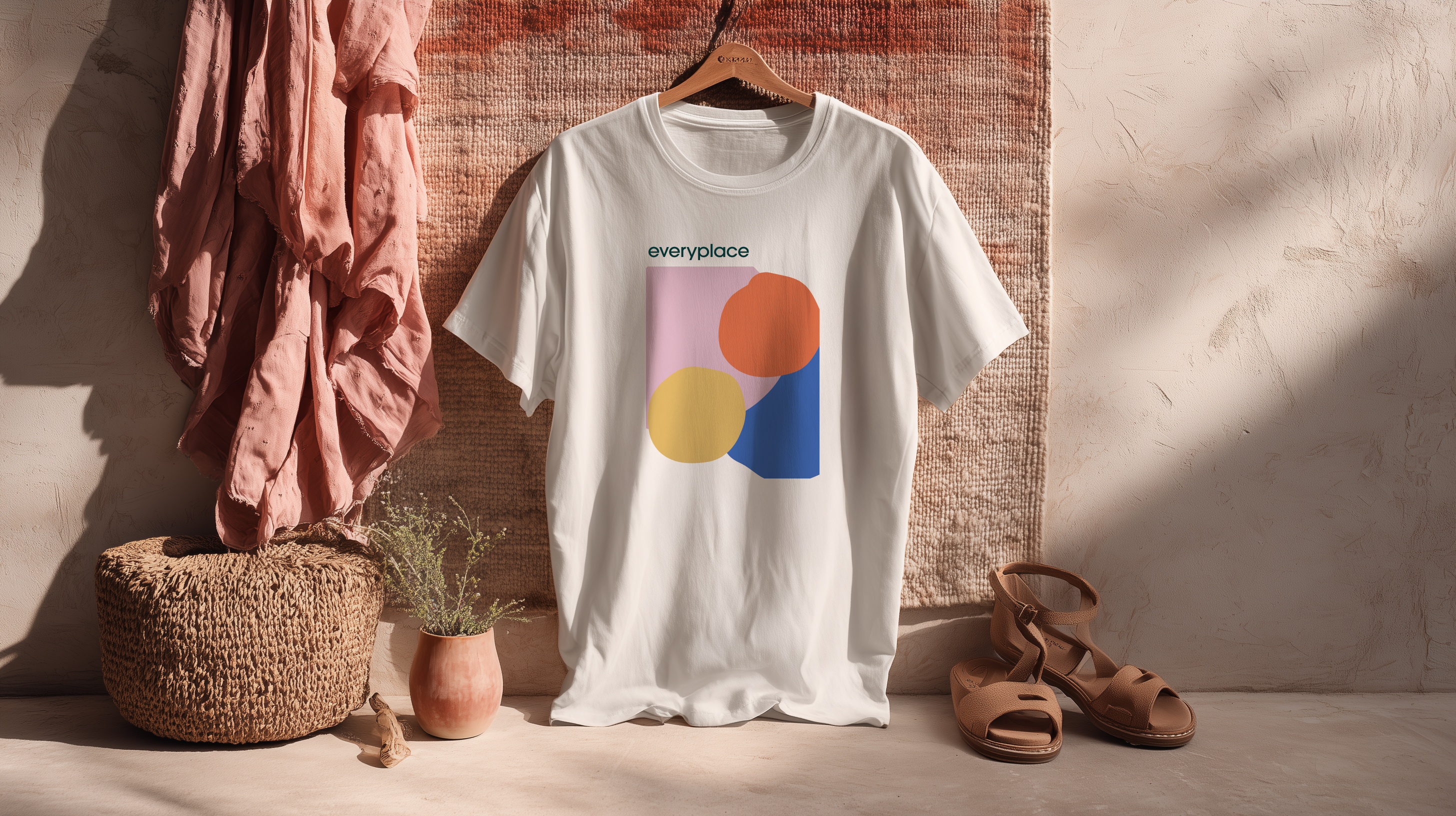
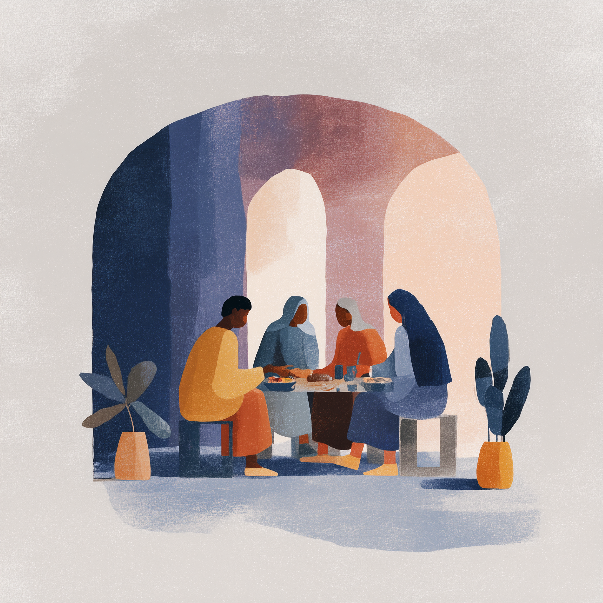
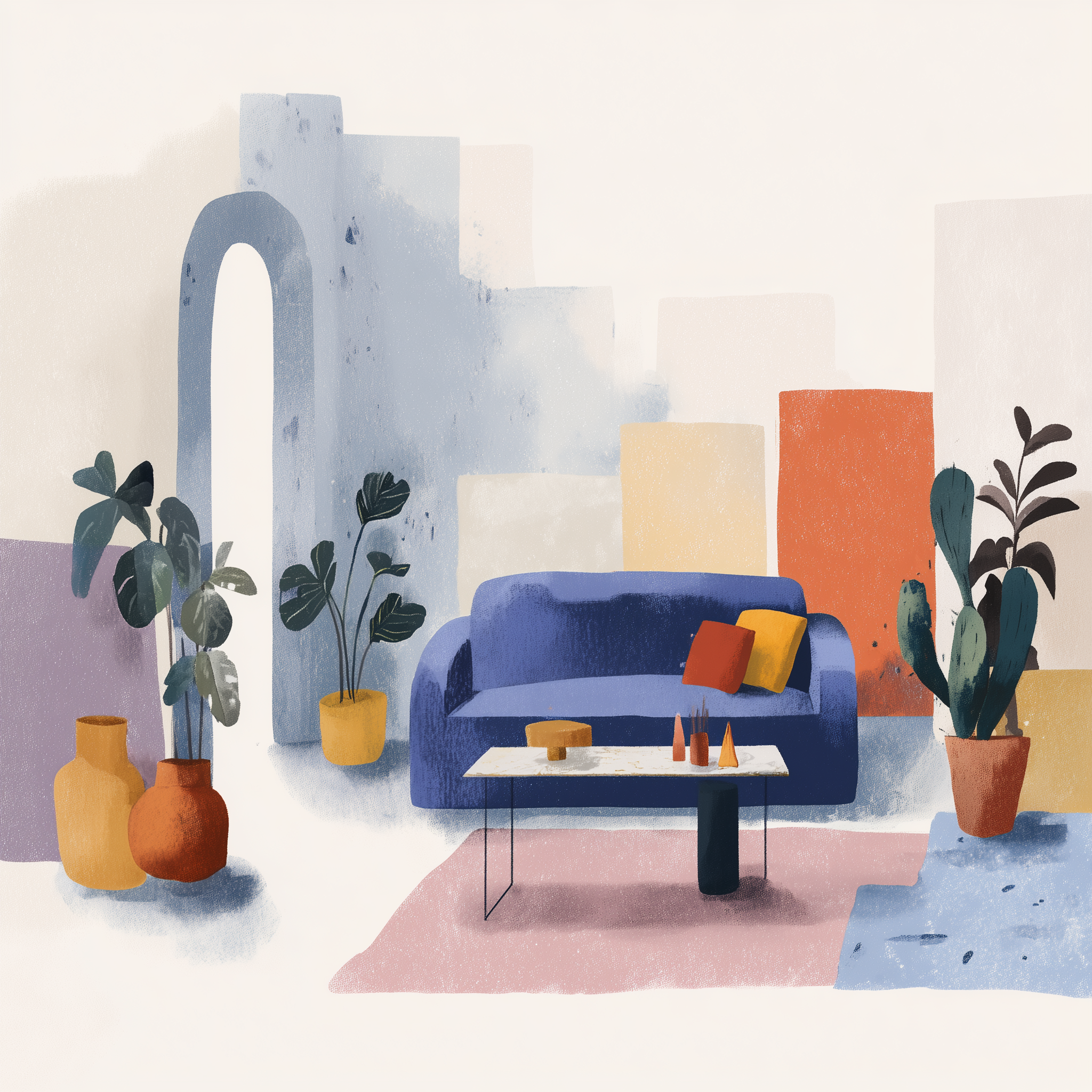
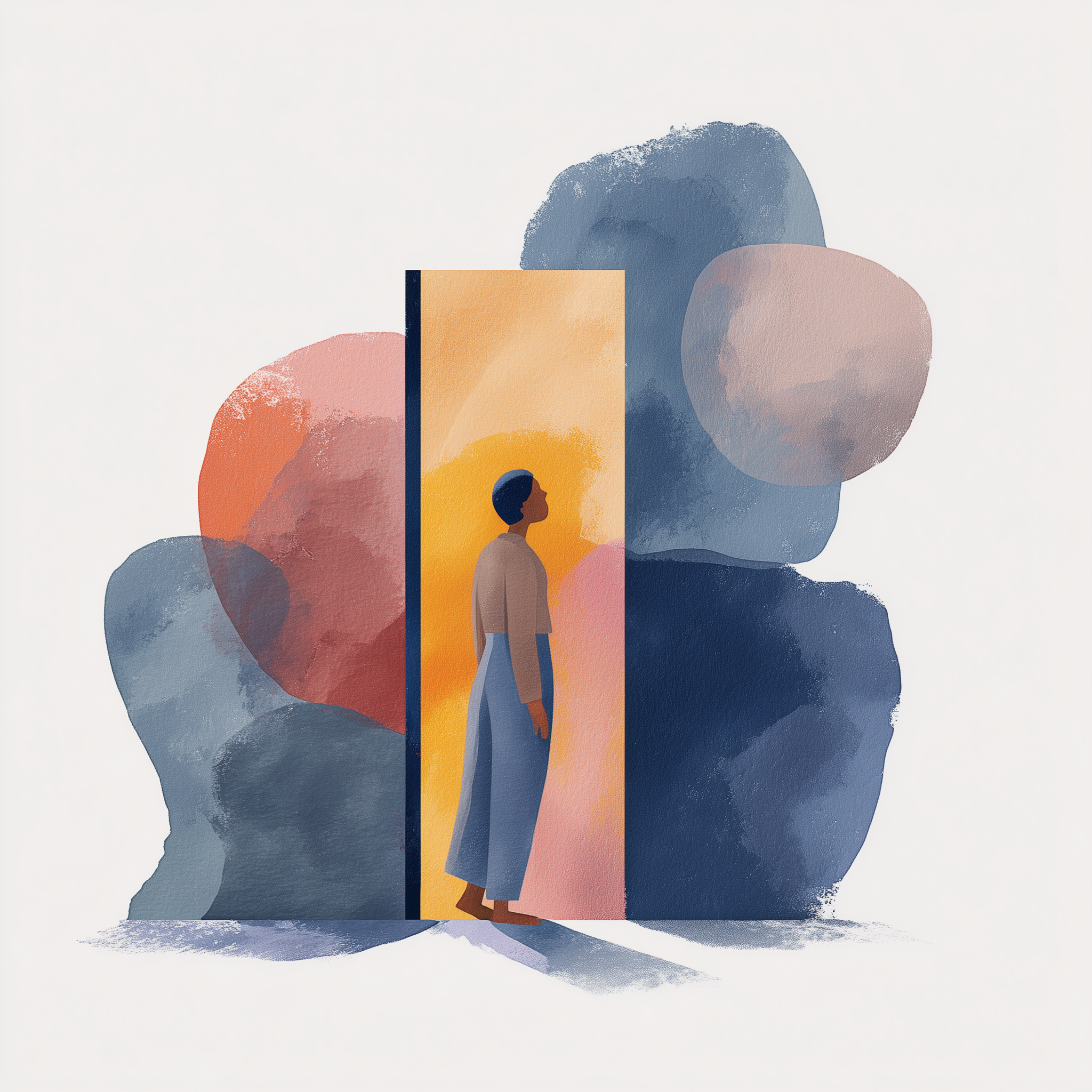
The system stretches from name and message to illustration, launch website, social language, and tactile brand moments - each expression pointing back to the same belief: every place deserves beauty.

The strategic shift
Home Ground Lab had a thoughtful model for helping refugee communities shape the places they live, but the public story still felt procedural.
Everyplace gave that work a name, voice, and visual world people could understand, remember, and support.
Built from the ground up
Because this was a young public brand, each decision had to do more than look beautiful. The name had to carry the belief. The language had to invite donors and partners in. The visuals had to feel human, careful, and unmistakably connected.
Naming and brand thesis
Core messaging system
Visual identity direction
Illustration and texture language
Website strategy and page flow
Launch-ready brand applications
The lived texture
Let’s build the world
We help early-stage and evolving organizations find the emotional center of their work, then turn it into a brand people can understand, remember, and believe in.