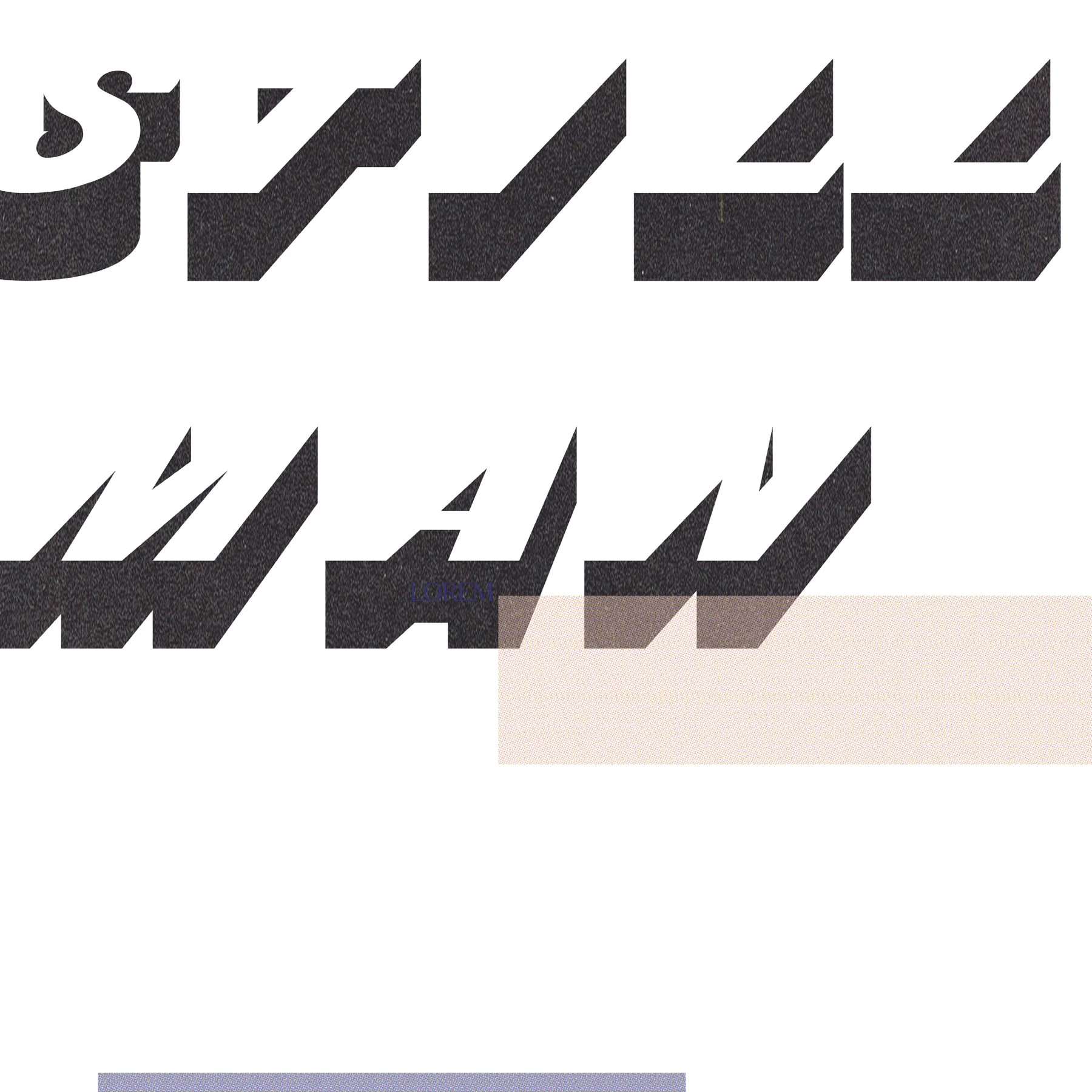
Stillman – A New Era for an Established Sound
Reimagining the Visual Identity of Stillman
When Stillman approached us, he was looking for more than just a refreshed look—he wanted a brand identity that truly reflected his evolution as an artist. His music is deeply personal, rich in storytelling, and layered with emotion, and his brand needed to mirror that depth.
Crafting a Visual Identity That Resonates
We set out to build a brand aesthetic that felt authentic, modern, and unmistakably Stillman. By refining his logo, color palette, and overall design language, we created a cohesive visual identity that not only aligned with his sound but also strengthened his connection with his audience.
Designing for Impact Across Every Platform
From album artwork and social media visuals to merchandise and digital assets, every touchpoint was carefully considered. The new branding seamlessly translates across platforms, ensuring a unified presence that feels both professional and deeply personal.
Audience Connection & Success
The response to Stillman’s rebrand was immediate and powerful. Fans embraced the new look, and the refreshed identity elevated his presence in the industry, reinforcing his credibility as an artist. The updated visuals have played a key role in enhancing engagement, growing his audience, and making a lasting impression.
A Brand That Matches the Music
With this transformation, Stillman now has a brand that evolves with him—timeless yet fresh, intimate yet bold. His audience sees him in a new light, and his music is now backed by a visual identity that truly represents the artist he has become.


